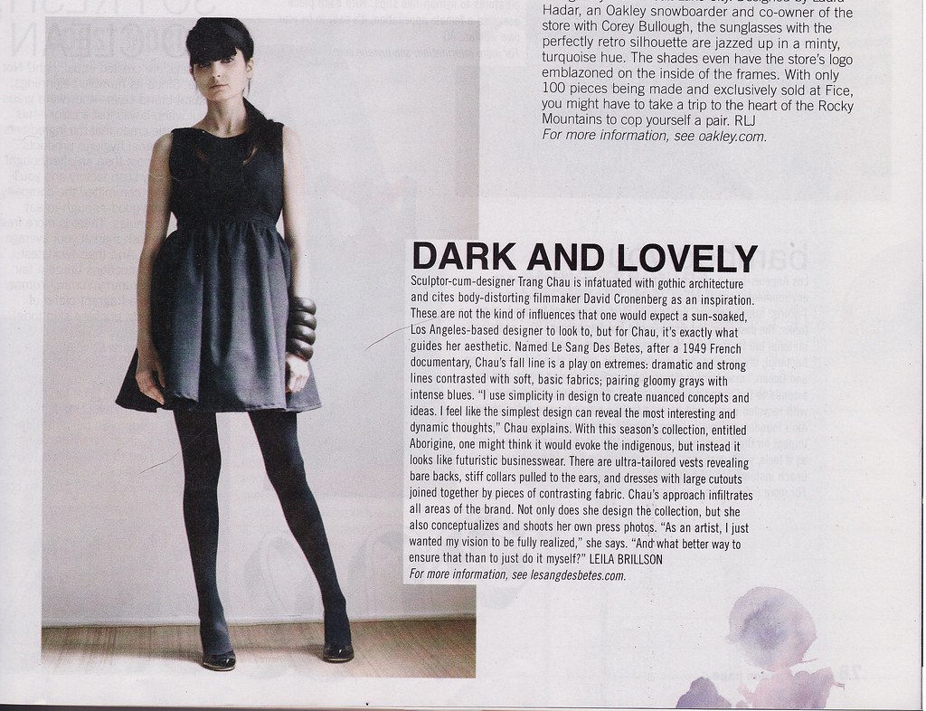
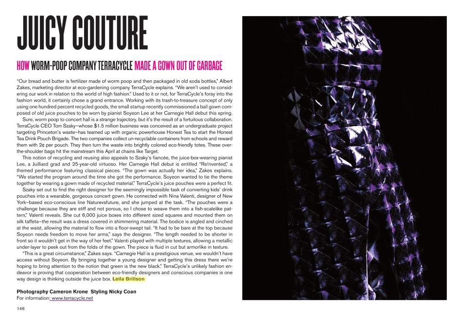
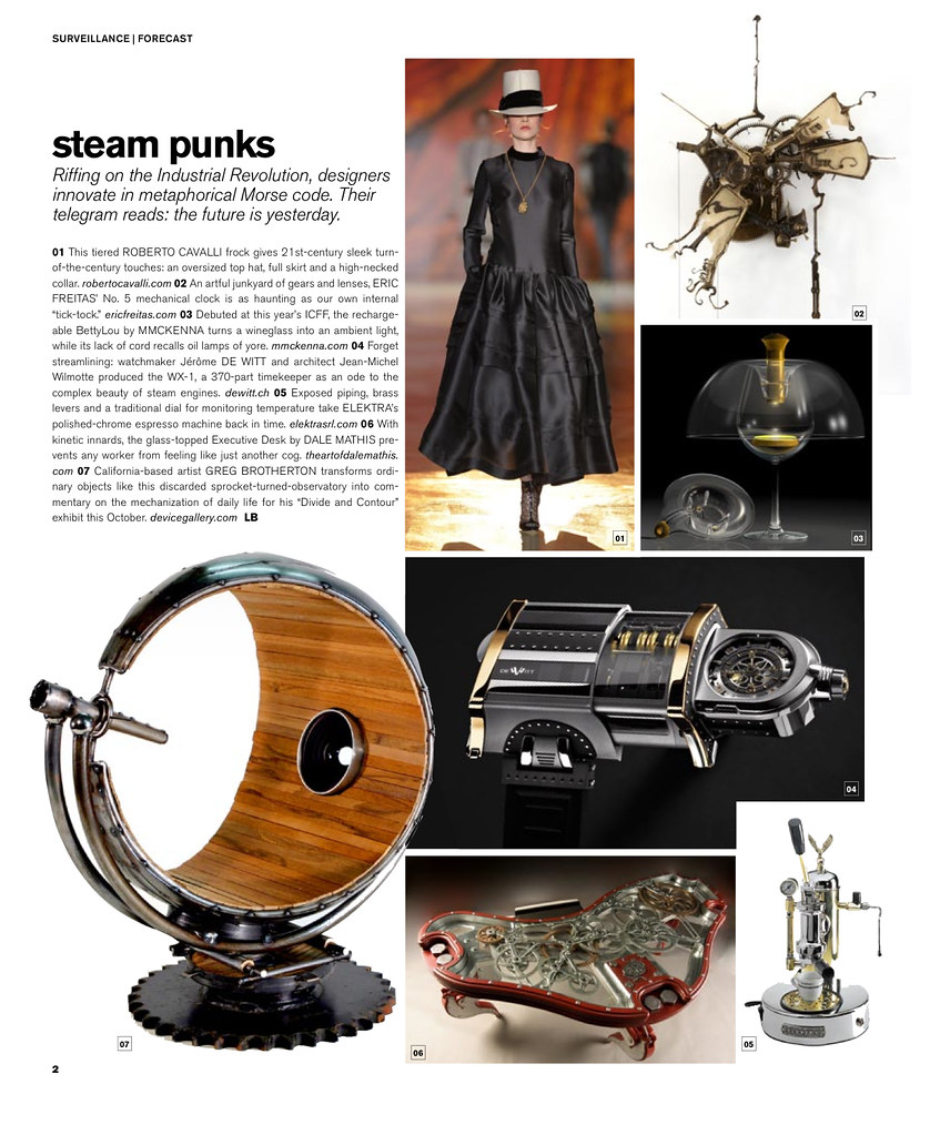
How awesome is my new logo?
Thanks so much, Zach Weiss!
Showing posts with label Design. Show all posts
Showing posts with label Design. Show all posts
Thursday, August 6, 2009


Tuesday, December 23, 2008
Jews and Design :: Hannukah version
While we often joke at Surface about doing a Jewish issue (no Zaha or Karim...but plenty of Dror!), the most basic way to look at the secular nature of design influencing a non-secular lifestyle is religious imagery. And since the cross is pretty much canon and the tree gets all the glory anyway (and the Kwanzaa Kinara is, you know, a lot like a menorah), leave it to the Heebs to come up with pretty fancy holiday decor. So here is my round up of the season's best (and most clever) menorahs, in no particular order:

Holiday Skyline Menorah by Jonathan Adler

The Man-Orah by Josh Korwin and Alyssa Zukas

The Hannu-kit at Reddish

Sahar Batsry's Flame Menorah

Last Match Menorah by Kathleen Walsh

Cube Modern Menorah by Modern Tribe

Menorah Glass Candleholder by Frabel

Rivington - at Maxwell Silver
From Leila "Not Quite A Jew...More, Just Jew...ish" Brillson

Holiday Skyline Menorah by Jonathan Adler

The Man-Orah by Josh Korwin and Alyssa Zukas

The Hannu-kit at Reddish
Sahar Batsry's Flame Menorah
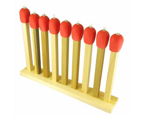
Last Match Menorah by Kathleen Walsh

Cube Modern Menorah by Modern Tribe

Menorah Glass Candleholder by Frabel

Rivington - at Maxwell Silver
From Leila "Not Quite A Jew...More, Just Jew...ish" Brillson
Thursday, December 4, 2008
DESIGN GLUT
I have to give some love to my two little friends, the charming Kegan Fisher and Liz Kinnmark, the totally irreverent and completely talented duo that make up Design Glut. Not only are they both adorable (by the looks of it, they just got themselves a shmancy photoshoot - but in real life the girls are less glam but equally cute), but they have a fledgling little Brooklyn design firm that focuses on cheeky, DIY projects.

Also, and not to make me biased, they attend Surface events like it's their job. They come to parties, to speaking events - they are like the smart, interesting kids that you always meant to be friends with in high school - but for the New York indie design scene.
Of course, they just launched a sale on their site, which is impeccably designed and very visually appealing. A couple of their products are pretty rad, like the globally inspired world links necklace:

Which is only $60, but at their sale price is less than $50.
I also like their newly introduced world currencies money clip...:

REMEMBER: Use coupon code HAPPYFUCKINGHOLIDAYS
I recently got emailed about this small DIY project the two girls conceived of (with a $100 prize!) involving a Christmas tree ornament and following some cutting-and-folding instructions. Commenting on the current economic situation, the girls are encouraging people to cut out their money-tree-topper, assemble it and send them a picture of the project for prizes and general sense of community. Take a looksee here and see what you can come up with. Can you beat these two? Send me a copy if you dare to submit.

Happy fucking holidays, indeed.

Also, and not to make me biased, they attend Surface events like it's their job. They come to parties, to speaking events - they are like the smart, interesting kids that you always meant to be friends with in high school - but for the New York indie design scene.
Of course, they just launched a sale on their site, which is impeccably designed and very visually appealing. A couple of their products are pretty rad, like the globally inspired world links necklace:

Which is only $60, but at their sale price is less than $50.
I also like their newly introduced world currencies money clip...:

REMEMBER: Use coupon code HAPPYFUCKINGHOLIDAYS
I recently got emailed about this small DIY project the two girls conceived of (with a $100 prize!) involving a Christmas tree ornament and following some cutting-and-folding instructions. Commenting on the current economic situation, the girls are encouraging people to cut out their money-tree-topper, assemble it and send them a picture of the project for prizes and general sense of community. Take a looksee here and see what you can come up with. Can you beat these two? Send me a copy if you dare to submit.

Happy fucking holidays, indeed.
Monday, December 1, 2008
All I Need Are Some Lights On A String
This weekend, in a fit of passion, I pushed all of my furniture to the center of the room, pulled my clothes out of the drawers and knocked books off of shelves. It wasn't a temper tantrum - I just decided that I needed to freshen things up before winter really sets in. What has appeared, apparently, is a blank spot around my bed that needs some type of lighting apparatus.
While I'd prefer not to channel the 14-year-old girl in me, I think I might be best off with string lights. You can find them in the weird Chinese import shops around Canal, you can find them at Oriental Trading and, apparently, while stringlights.com is not registered, partylights.com IS.
While I don't want jalepenos or rubber ducks or something like that, I'm not quite willing to succumb to Christmas lights. I DO work at a design mag. I COULD possibly think of something more creative than the lighting that you put around a pine tree.
So, easy first stop: momastore.org.
It's the no-duh of design shopping, and I query string lights, and BAM, they got 'em. Of course, they happen to be the string lights from the previous post, which are certainly not worth the $100 dollar price tag and aren't exactly mood creating.

String Ten Light
And while they look awesome in a set of three, one lonely one in my room would be pathetic.
Then I head over to one of my favorite blogs, Design Boom, which does a nice job of covering the conceptual and the practical. I search "string lights" because I don't know a better term, and the only hit are the damn Brilliant Lights installation I saw at the Seoul Design Olympiad. Seriously.

And I definitely think I would creep myself out with those above my bed.
So I head over to the old trustworthy Ikea page. And Ikea has some affordable lighting options that an adult might use - not all hearts, butterflies, weird lanterns and stars. Like the (bear with me)
Kallt

Or the kind of awesome spidery Minnen.

But no, look at the lighting page found here: http://www.ikea.com/us/en/catalog/categories/departments/lighting/14971?pageNumber=0
Not one, not one of those lighting options are available for shipping. And if you think I'm going to waste a Saturday trekking to Red Hook for some string lights...you don't work as hard as I do.
In desperation, I hit up Target, hoping to find SOMETHING, maybe some Jonathan Saunders designed lighting, or at least Isaac Mizrahi...But have you ever shopped at Target online? It's like shopping the store - rows and rows of hits come up with decreasing relevancy. Wrong size, weird color, you think you saw it cheaper in another department. And the tags are labeled:
But what's the difference between novelty, string and string and hanging? I cannot possibly cope, even though I found a semi tolerable mesh-bronze string lights, which I am not purchasing because I'm not spending $50 on something that could, upon further review, look like a bug zapper.

The moral is: who needs shopping savvy and design blogs when you have good ole DIY-ingenuity. So I'm going to do what any good Brooklyn-dweller would do...I'm going to march down to a hardware store, get some sturdy wire and christmas lights, and mold and shape my own damn lamp, thankyouverymuch.
While I'd prefer not to channel the 14-year-old girl in me, I think I might be best off with string lights. You can find them in the weird Chinese import shops around Canal, you can find them at Oriental Trading and, apparently, while stringlights.com is not registered, partylights.com IS.
While I don't want jalepenos or rubber ducks or something like that, I'm not quite willing to succumb to Christmas lights. I DO work at a design mag. I COULD possibly think of something more creative than the lighting that you put around a pine tree.
So, easy first stop: momastore.org.
It's the no-duh of design shopping, and I query string lights, and BAM, they got 'em. Of course, they happen to be the string lights from the previous post, which are certainly not worth the $100 dollar price tag and aren't exactly mood creating.

String Ten Light
And while they look awesome in a set of three, one lonely one in my room would be pathetic.
Then I head over to one of my favorite blogs, Design Boom, which does a nice job of covering the conceptual and the practical. I search "string lights" because I don't know a better term, and the only hit are the damn Brilliant Lights installation I saw at the Seoul Design Olympiad. Seriously.

And I definitely think I would creep myself out with those above my bed.
So I head over to the old trustworthy Ikea page. And Ikea has some affordable lighting options that an adult might use - not all hearts, butterflies, weird lanterns and stars. Like the (bear with me)
Kallt

Or the kind of awesome spidery Minnen.

But no, look at the lighting page found here: http://www.ikea.com/us/en/catalog/categories/departments/lighting/14971?pageNumber=0
Not one, not one of those lighting options are available for shipping. And if you think I'm going to waste a Saturday trekking to Red Hook for some string lights...you don't work as hard as I do.
In desperation, I hit up Target, hoping to find SOMETHING, maybe some Jonathan Saunders designed lighting, or at least Isaac Mizrahi...But have you ever shopped at Target online? It's like shopping the store - rows and rows of hits come up with decreasing relevancy. Wrong size, weird color, you think you saw it cheaper in another department. And the tags are labeled:
But what's the difference between novelty, string and string and hanging? I cannot possibly cope, even though I found a semi tolerable mesh-bronze string lights, which I am not purchasing because I'm not spending $50 on something that could, upon further review, look like a bug zapper.
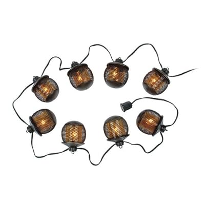
The moral is: who needs shopping savvy and design blogs when you have good ole DIY-ingenuity. So I'm going to do what any good Brooklyn-dweller would do...I'm going to march down to a hardware store, get some sturdy wire and christmas lights, and mold and shape my own damn lamp, thankyouverymuch.
Thursday, September 18, 2008
DESIGN FOR OBAMA
Aaron Perry Zucker, a senior at RISD, launched Design For Obama, a clever grassroots based website that allows designers (or aspiring designers) to upload campaign images for the presidential hopeful to be voted upon. Users can download images and print them, creating their own Obama '08 signs (that are usually cooler than anything political campaigns send out).
My darling readers, this is an example of grassroots meeting the global community. This is an example of youth getting involved in politics in an effective and anti-aggressive way. This is an example of how art can become influential without being commodified!
And its also pretty cool. I highly doubt McCain supporters would get together and start designing and the democratizing their projects.
Its not very good right now, but I believe it just came up because I've noticed more additions each time I've visited the page. So go, sign up and vote or contribute a creation (and vote in November too!)

via Core 77
My darling readers, this is an example of grassroots meeting the global community. This is an example of youth getting involved in politics in an effective and anti-aggressive way. This is an example of how art can become influential without being commodified!
And its also pretty cool. I highly doubt McCain supporters would get together and start designing and the democratizing their projects.
Its not very good right now, but I believe it just came up because I've noticed more additions each time I've visited the page. So go, sign up and vote or contribute a creation (and vote in November too!)

via Core 77
Sunday, June 1, 2008
Ugly Body Chairs, or How Design Mostly Sucks
I ran into these chairs separately but they disturbed me equally. I understand that, instead of invoking the sensuality of the human form, they literally translate it and I suppose thats kind of cool, but in the polyurethane and solid colors (both of them just look incredibly plastic-y), it resembles kid's furniture a bit to much.
Aaaaaand its creepy.

First of all, just because you are a hipster icon who thinks he can make shoes, you can't design furniture. Pharrel's Perspective Chair is debuting at the otherwise respectable Galerie Perrotin, and he has some nice explanation about being in love etc. and I suppose its clever because you are literally "putting yourself in someone else's position." But its ugly. I mean, its a seat with feet attached. There is no transition, no smooth lines. It just looks like the girl is taking it in the rear, which is fine - I just don't want to sit on it.

And the sexuality only gets more perverse with Fabio Novembre's "Her" chair which I saw all over this past ICFF. With a delicate ass-mold (which is actually much bigger than it looks, I could scoot around in it), Novembre got all Milk Bar in Clockwork Orange and put a woman almost on her knees. Its kind of funny because you feel kind of exposed sitting in it, like everyone is looking at your tush, but its more of a gimmick than a beautiful piece of furniture. And on top of that, I know its literally "objectifying" women and thats kind of a statement, but its simply too over the top to be a decent design object. Basically, designing something as a conversation piece almost dooms it immediately.

While I appreciate the idea of using unconventional forms, these just seem a little too creepy and corporal for my liking - perhaps I just don't like overt sexuality in my house hold objects. And I just think ole Mr. Williams design is just heinous.
Via Billionaire Boys Club
Aaaaaand its creepy.

First of all, just because you are a hipster icon who thinks he can make shoes, you can't design furniture. Pharrel's Perspective Chair is debuting at the otherwise respectable Galerie Perrotin, and he has some nice explanation about being in love etc. and I suppose its clever because you are literally "putting yourself in someone else's position." But its ugly. I mean, its a seat with feet attached. There is no transition, no smooth lines. It just looks like the girl is taking it in the rear, which is fine - I just don't want to sit on it.

And the sexuality only gets more perverse with Fabio Novembre's "Her" chair which I saw all over this past ICFF. With a delicate ass-mold (which is actually much bigger than it looks, I could scoot around in it), Novembre got all Milk Bar in Clockwork Orange and put a woman almost on her knees. Its kind of funny because you feel kind of exposed sitting in it, like everyone is looking at your tush, but its more of a gimmick than a beautiful piece of furniture. And on top of that, I know its literally "objectifying" women and thats kind of a statement, but its simply too over the top to be a decent design object. Basically, designing something as a conversation piece almost dooms it immediately.

While I appreciate the idea of using unconventional forms, these just seem a little too creepy and corporal for my liking - perhaps I just don't like overt sexuality in my house hold objects. And I just think ole Mr. Williams design is just heinous.
Via Billionaire Boys Club
Monday, May 26, 2008
Clinical Joy
Sometimes I really like when design forgets to take itself seriously.

UK firm VITAMIN just put this crazy IV pot for your plants into production, allowing amateur botanists to regulate the amount of water their plants receive, while at the same time giving any room a kind of hospital-y, clinical chic. Its fiberglass, so it wouldn't be as heavy as it looked.


I like the white way better. If you are going to get the whole ER vibe in your living room, don't go half way. This reminds me of this restaurant/club I read about in Singapore called The Clinic which has this whole "outpatient" theme going where you drink out of IV's and eat in stainless steel kidney shaped bowls and sit in wheelchairs. They also have art by Damien Hirst lining the walls, and its very surreal/super saturated.

I like that we have finally embraced the glory of being sick.

UK firm VITAMIN just put this crazy IV pot for your plants into production, allowing amateur botanists to regulate the amount of water their plants receive, while at the same time giving any room a kind of hospital-y, clinical chic. Its fiberglass, so it wouldn't be as heavy as it looked.


I like the white way better. If you are going to get the whole ER vibe in your living room, don't go half way. This reminds me of this restaurant/club I read about in Singapore called The Clinic which has this whole "outpatient" theme going where you drink out of IV's and eat in stainless steel kidney shaped bowls and sit in wheelchairs. They also have art by Damien Hirst lining the walls, and its very surreal/super saturated.

I like that we have finally embraced the glory of being sick.
Subscribe to:
Posts (Atom)